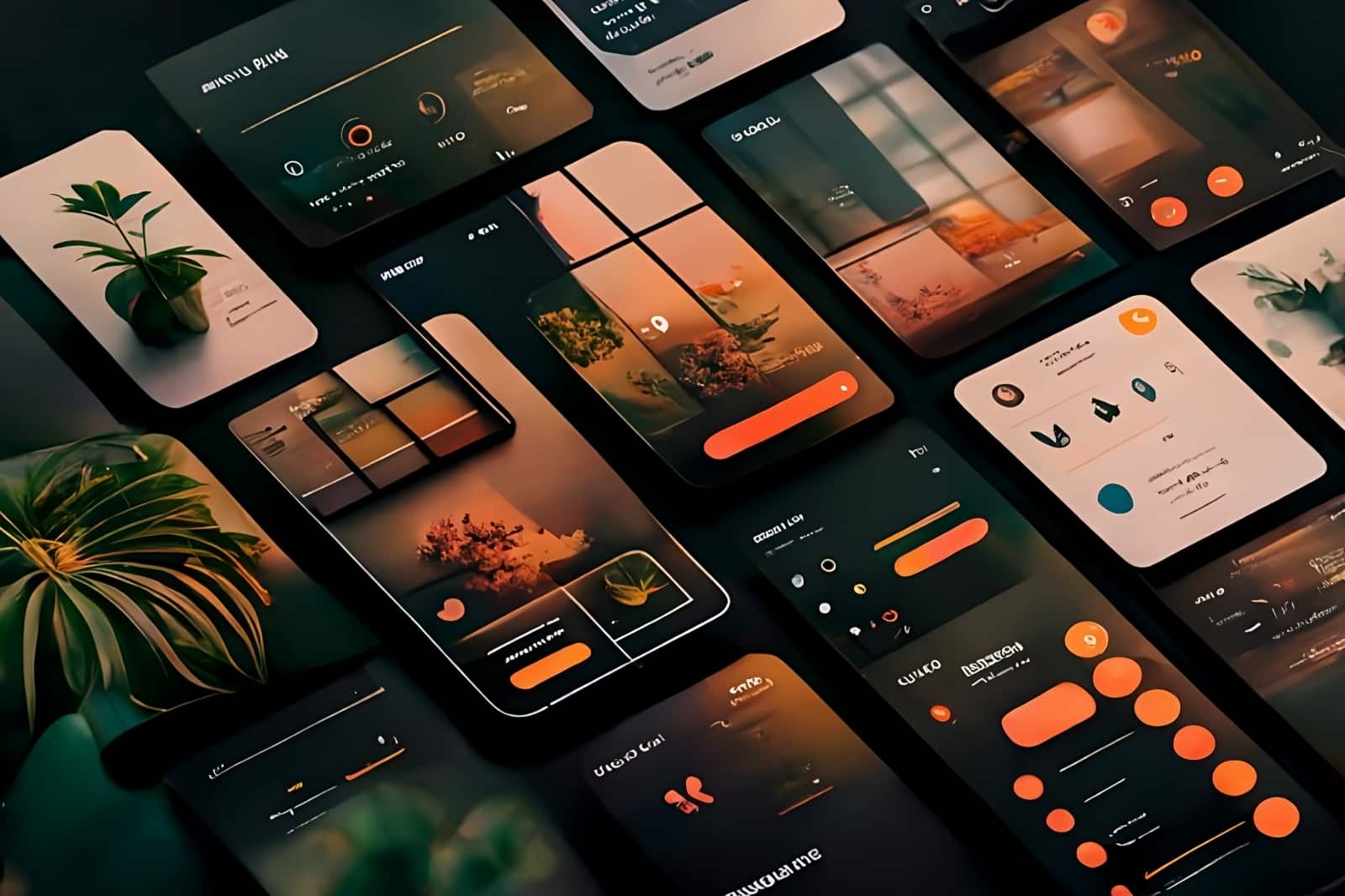
Most shoppers nowadays find their merchandise online, so it’s imperative to have a mobile friendly website. Mobile friendly websites rank better than desktop websites. Unfortunately, it’s not so simple as cutting and pasting your desktop website onto a mobile platform. You will have to create a mobile website with the user in mind that best shows off your content.
Mobile-Friendly Design Tips
- Use visual hierarchy
- Put the most important visuals at the top, including featured products, sale items, new collections, etc.
- Avoid large bodies of text
- Don’t overload your audience with massive bodies of content or images.
- Avoid having your audience over scroll.
- Make content clickable
- Don’t make your website hard to navigate. Customers want to quickly access information.
- Forget hover control
- On phones, customers don’t have a mouse and thus have less control over their clicking.
- Use “tap to zoom” or “swipe for back view.”
- Avoid extra digital weight
- Remove any unnecessary code, heavy media files, and activate Accelerate mobile pages for higher loading times.
- Use white space
- Keep things minimalistic and have enough white space to make your website more visually appealing.
- Provide easy communication channels
- Implement texting, messaging with chatbots or third-party apps.
- Make it easy for customers to leave reviews and comments.


